To make sure your target customers can relate to your company instantly- it is important to develop brand identity. This is one aspect no company can ignore and MNCs like Coca cola and Nike spend a huge amount of money for creating and revamping their corporate identity. Despite the money spent after numerous advertising campaigns and celeb brand ambassadors, brands pay attention to ensure their graphic identity is in sync with their public image. For a person the circular red and blue logo is synonymous with Pepsi and Apple is remembered by the bitten Apple logo!
To ensure your brand’s graphic identity reflects its image and remains in sync with aim, it is necessary to pay attention to a few aspects. These are:
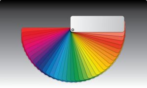
Color
Color is related with nuances of human psychology and different colors actually evoke varying emotions. You will find most entities belonging to healthcare sector using green and white colors in their logo. Similarly, brands targeting young and trendy women mostly use purple and pink in their logo and banners. Red is often associated with brave and vibrant aspects of life. Most colors stand out well against a backdrop of black and white but there are exceptions to this practice too.
Font
Using an apt font is also required to create a suitable graphic identity for your brand. While there is no hard and fast rule, type and demographic of your target audience should be taken into account. Ensure the fonts used in Logo and tagline are not difficult to read. Some MNCs use texts in such a way in their logo that it depicts symbols and reflects certain emotions.
Connect
The logo of your brand should not be confusing at any rate! It is not prudent to use graphical elements and design style that makes it hard for customers to relate to the brand.